The target audience is sustainable people.
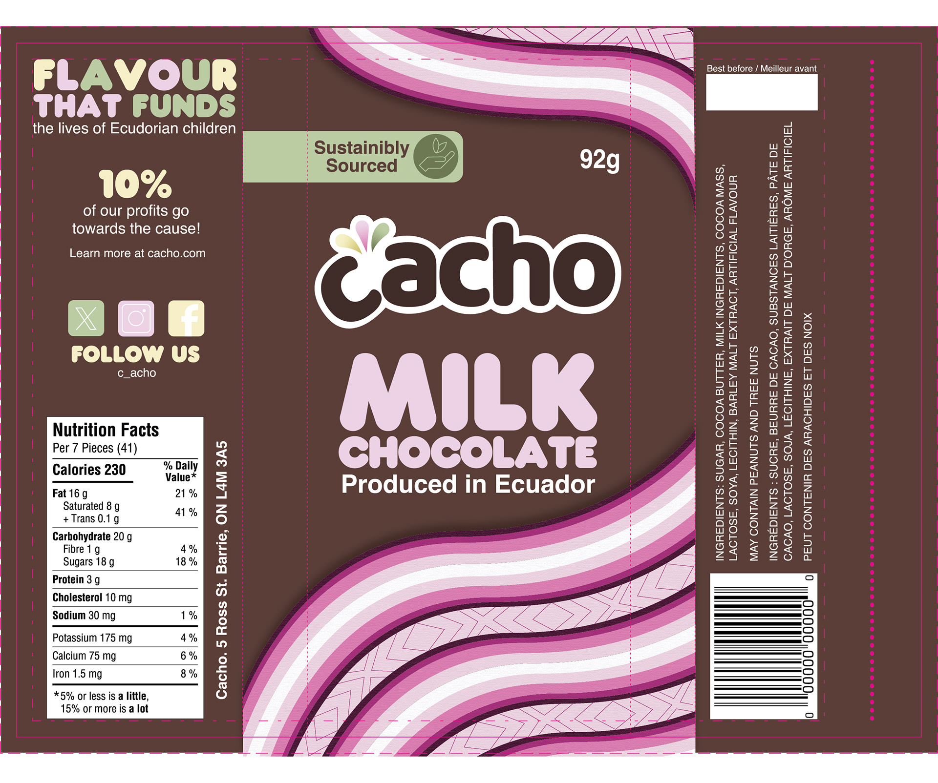
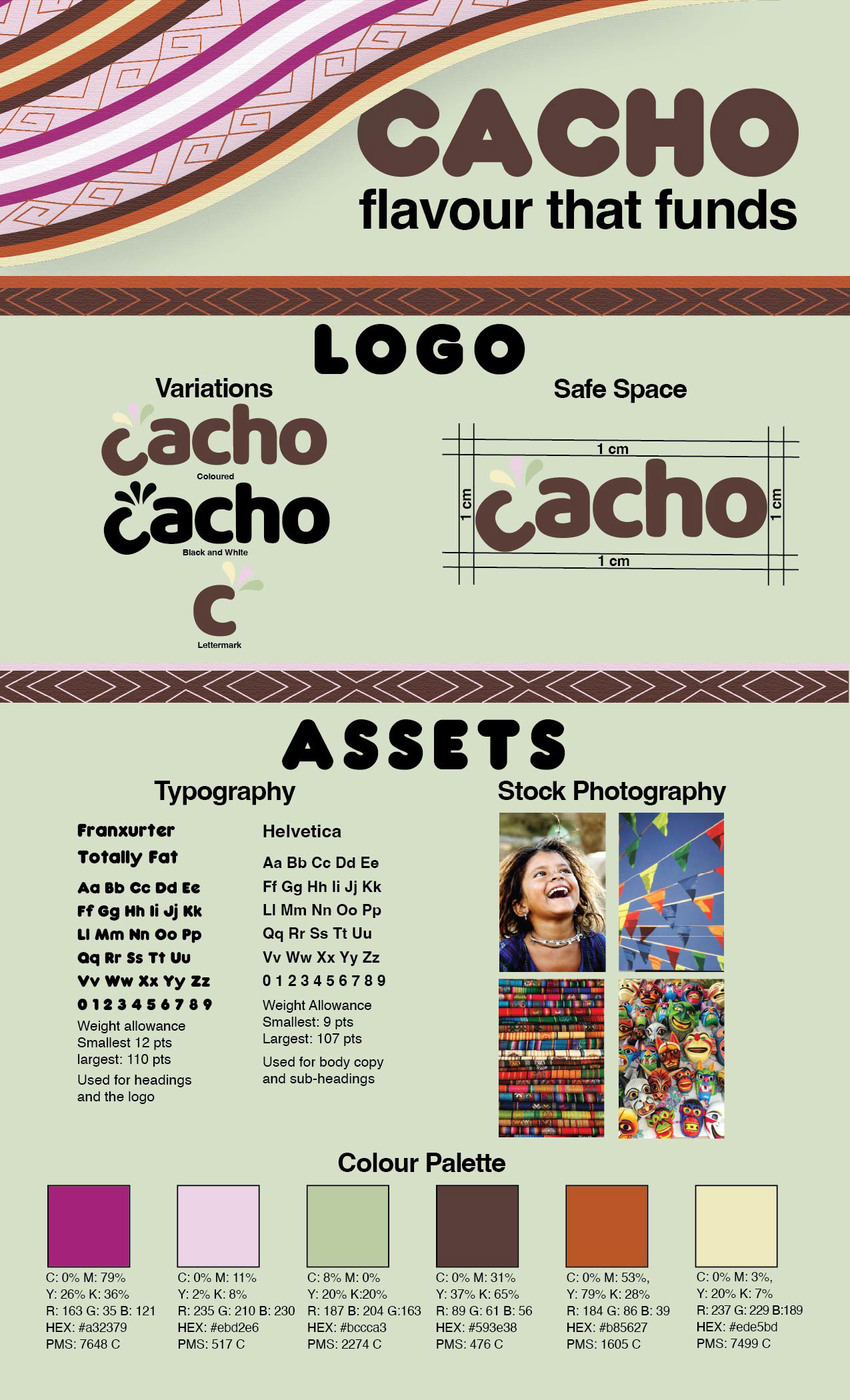
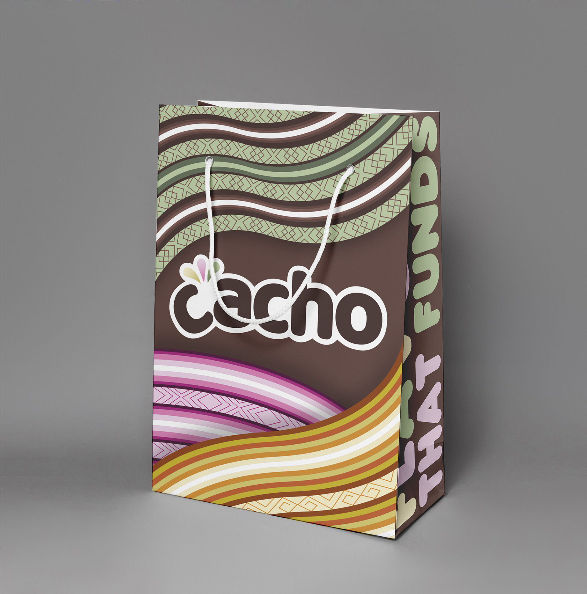
Ecuador is the producer because they have sustainable processes. The word chaco is a Ecuadorian slang word, which means take a break/chill, which works since you break a chocolate bar to eat it. I played further into the word by illustrating a break in the logo with flavour bursting out of it. To continue with the brand story I used the vibrant blankets seen in Ecuadorian culture as the assets, making it look like the products are being wrapped up by the blankets.
Logo
Style Guide
Mockups
a bag with the word cacho written in the centre with illustrations of colourful striped blankets wrapping around it and flavour that funds written on the side of it
two chocolate bars one on top of the other with pink illustrations of striped blankets wrapped around the bar the words chacho, milk chocolate, produced in Ecuador, and sustainably sourced written on the front
Dielines
a dieline of a bag with the word cacho written in the centre with illustrations of colourful striped blankets wrapping around it and flavour that funds written on the side of it
a dieline of a chocolate bar wrapper one on top of the other with pink illustrations of striped blankets wrapped around the bar the words chacho, milk chocolate, produced in Ecuador, and sustainably sourced written on the front
Back to Top