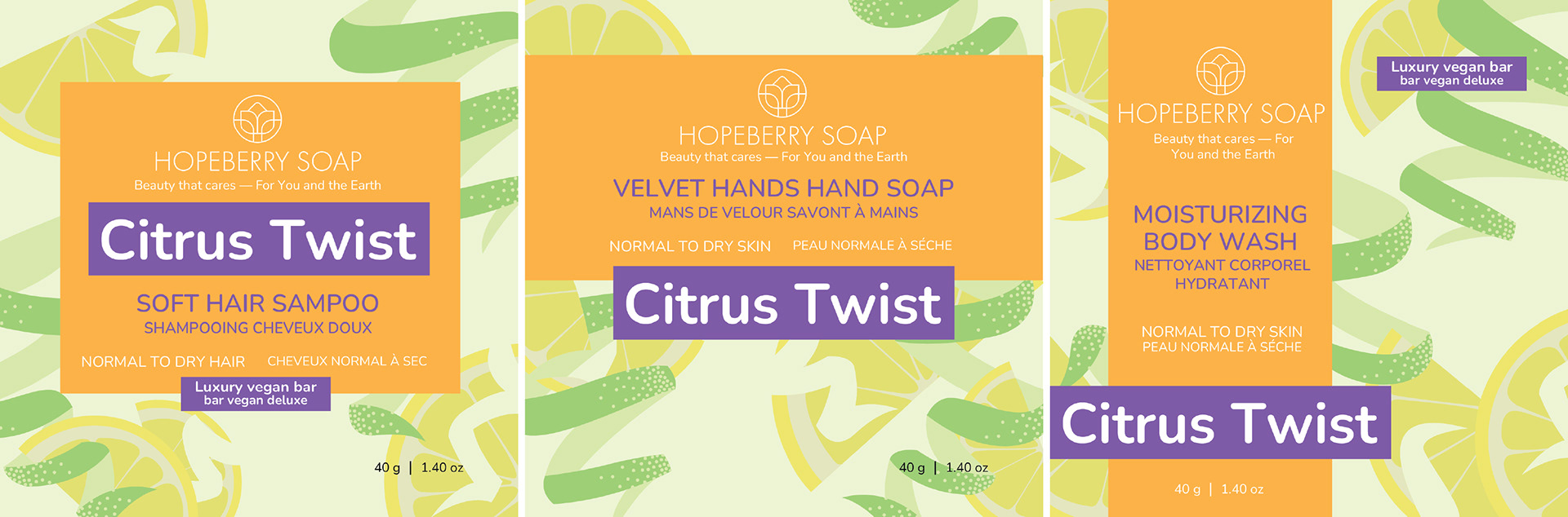
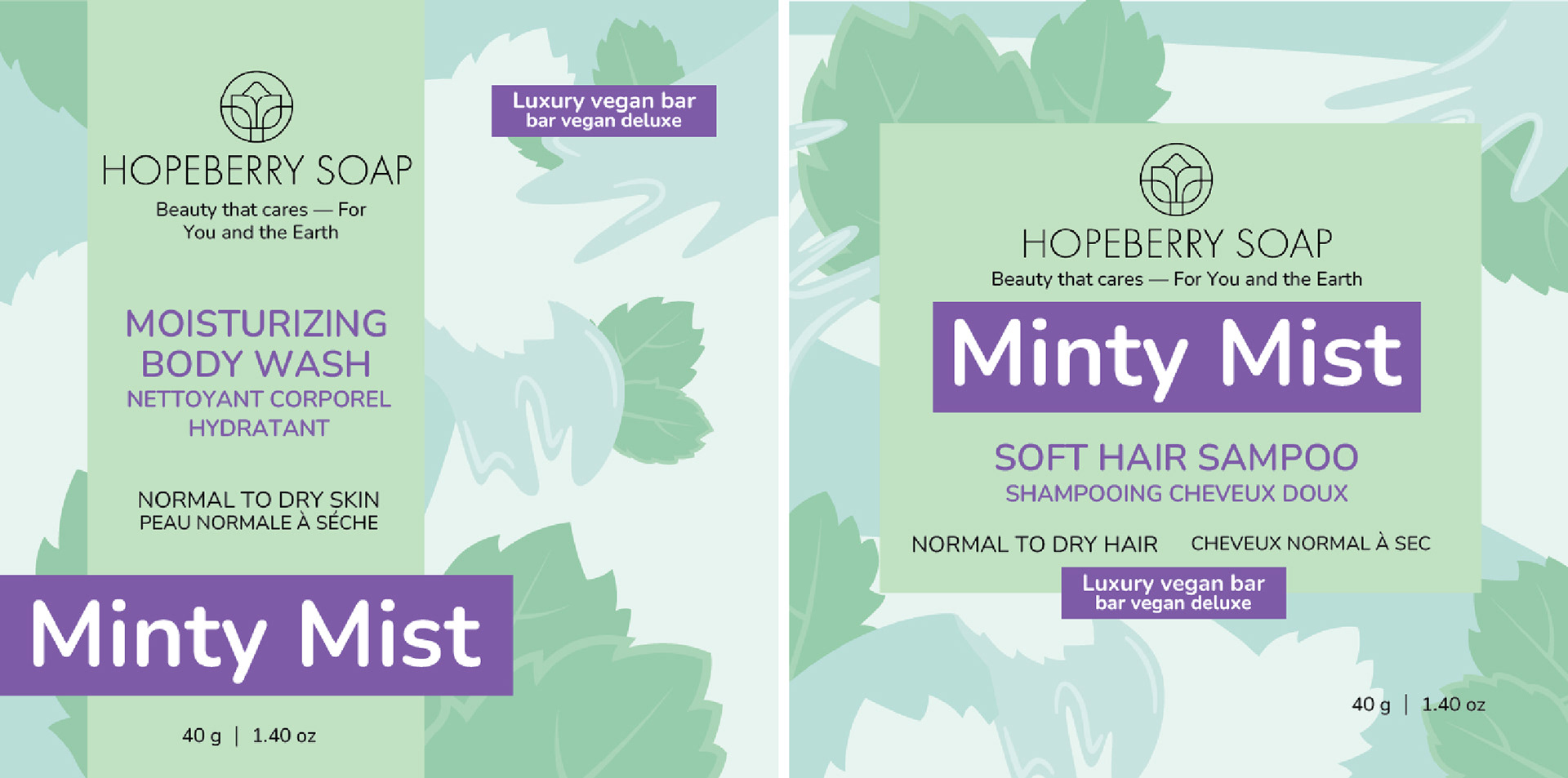
The client is a sustainable toiletry company who is looking to a rebrand couple of their products. The target audience are people who focus on and are interested in sustainability.
They were inspired by the body shops packaging, and wanted something similar. I took inspiration from each word in the scent and made an illustration to represent that. The rounded edges of Nunito work well with the sustainable look. I then utilized different layouts to differentiate the products, along with making the name of the product purple.
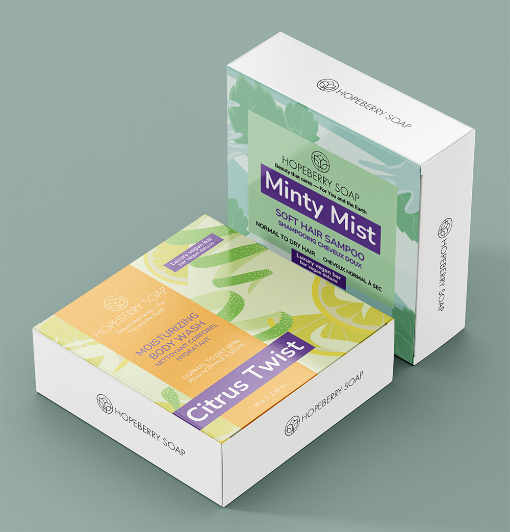
Mockup
Designs